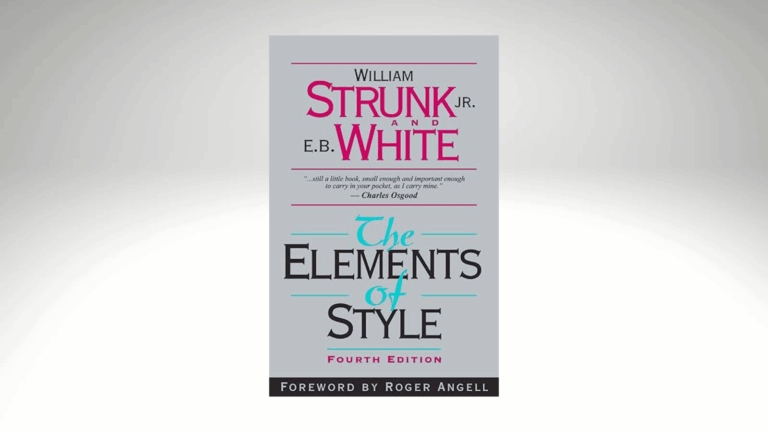
White space and subheads are just two examples of good graphic design.
WORDS vs. IMAGES
If someone were to hold a contest and these two were the competitors, who do you think would win?
If you agree with the phrase “a picture’s worth a thousand words,” you’d probably side with “images.” But if you’re a writer, chances are you’d say “words” would be the champion.
But in the end, I think it would be a tie.
That’s because, when it comes to good communication, BOTH are important.
Design isn’t just about images, though. The white space in the margins of a page or between paragraphs is part of the design too. So are font styles and sizes.
A good image or an unusual graphic, paired with well-written text, can dramatically increase the impact of any message you’re sending to your audience – whether that audience is a client, a prospective buyer, or even a loved one. (The last audience in this list is the reason greeting cards are so popular!)
These days, including graphics in your content is SO much easier than it was when I was starting my career. Once I finally settled on Mass Communications for my major at the 4-year college I would soon be attending, I was advised to choose the Graphic Design track.
My guidance counselor in junior college knew I had originally considered majoring in Art, so he thought Graphic Design was the perfect way to combine my two interests.
However, without the advantage of software (or even a computer!) to speed up and simplify the design process, I soon decided the Journalism track was a better fit for me. A few years later, as Managing Editor of a ham radio magazine, I happily discovered that I got to “do design” after all … every single month.
Almost everything was done manually back then – from laying out galleys on pages on top of a light table, to calculating the percentage of reduction for photos (thanks to my trusty proportional scale), to carefully placing the thin border tape around photos (with the help of an X-Acto knife, of course).
About five years after starting that job, I started hearing about word processing and desktop publishing. I couldn’t wait to experiment with this new way of preparing publications!
Eventually, of course, everyone was using digital forms of layout. (Computers DID speed up the layout process, but sometimes, I still missed the old-fashioned way of doing things.)
6 GRAPHIC DESIGN TIPS
As more and more people began using desktop publishing to create their own publications and ads, I started seeing problems crop up. I soon realized that just knowing how to use a tool doesn’t mean the end result will be good … if you don’t understand the principles of design.
Hopefully, the tips I’m sharing here will help you find new ways to enhance YOUR next message.
> Limit the number of fonts to no more than two in any advertisement or flyer. (At the very most, three – if the ad or flyer is large.)
> Body text should be a different font style than headline text.
> Be sure the elements on a page (image, text, headline) are aligned properly. (This is especially important if your text and graphic are either left-aligned or right-aligned. Even if the alignment is only slightly off, it WILL be noticed.)
> Keep paragraphs (and sentences) short. Your messages will be easier to read.
> Use lots of white space. Large blocks of type usually don’t get read … especially online!
> When creating documents that will be read online, fonts should always be sans serif (such as Arial, Helvetica, or Tahoma). Serif fonts (like Times New Roman, Garamond, or Palatino) are too hard to read on a computer screen. (The opposite is true of print documents, where serif fonts are actually EASIER to read. Headlines should still be sans serif, though.


